A logo is the centre of a brand identity. For big companies, a quick glance at a shape or single letter can result in people recognising the company instantly. When ordering promotional products, the printed logo is extremely important, and putting some thought into how it will look in different situations is worth the time. Your logo will be how the client remembers your company and could be the very first thing they see of your company. This blog will be looking at the current trends in logo design, including typography, colours and other styling choices.
Colours
Colours are a key part of a logo. Most brands have one or two key colours, and these colours are considered very carefully before being chosen for the final design. Some of your favourite websites may use the colour blue on their logo, an example is a well-known social media website. Recent psychological research has shown that blues have a calming effect and can stop the brain from feeling tired, this makes people stay on a website for longer periods of time.
On the other hand, reds are considered to make the brain think more aggressively, this is why the bad guys in movies or video games are often portrayed with a red palette.
Green brings to mind images of the environment, this is why environmentally friendly firms will often use green colours for their branding.
Typography
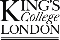
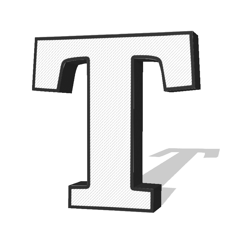
There are two main types of typefaces which are commonly used, serif (pictured) and san serif – the text this blog is written in is a san serif font. We can see serifs in the image below, they're the small 'hooks' on the end of the lines. San serif generally looks more modern, while serif text looks more classical.
Design Trends
In a retro design, extrusions are becoming more popular. Extrusion is a term from 3D design, it means that something is extended outwards, like this letter. Detailed extrusions are becoming more and more popular in logo design due to their retro styling.
The Total Merchandise Logo
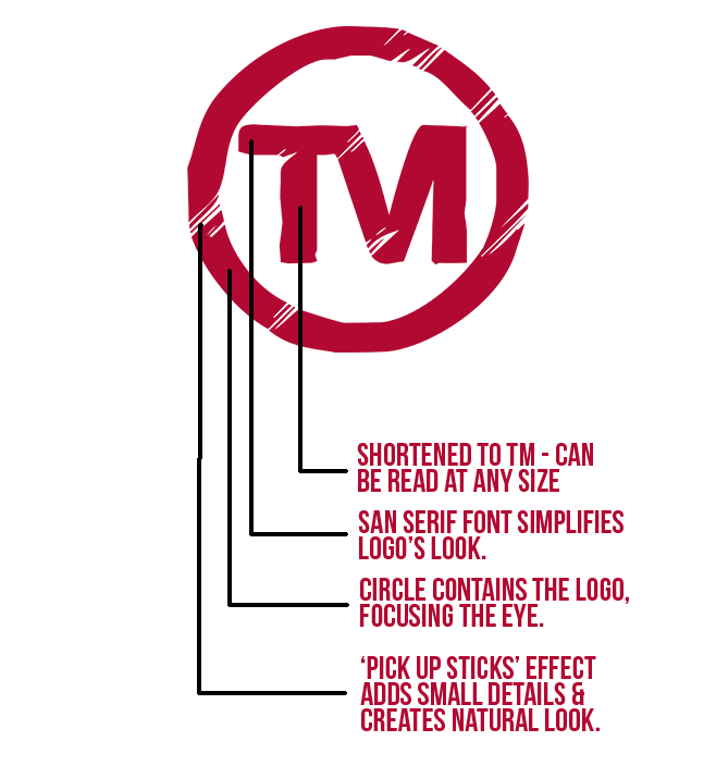
Here we have broken down the Total Merchandise logo into its key elements.
The Total Merchandise logo uses a simplified brand name, TM, which means it can still be read at any size, whether it's on a tiny letterhead, at the top of a website, or on a huge poster. This is great if we were to print on smaller promotional products, whereas for bigger products we might use the longer more detailed version of our logo.
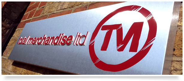
The TM letters are contained within a circle which draws the eye into the brand name.
The font used is san serif which is considered to be more modern and simple.
A 'Pick up sticks' style refers to a series of seemingly random lines. Some logos use this for their entirety but the Total Merchandise logo uses it in small areas to create a small amount of detail and add a natural aesthetic.
